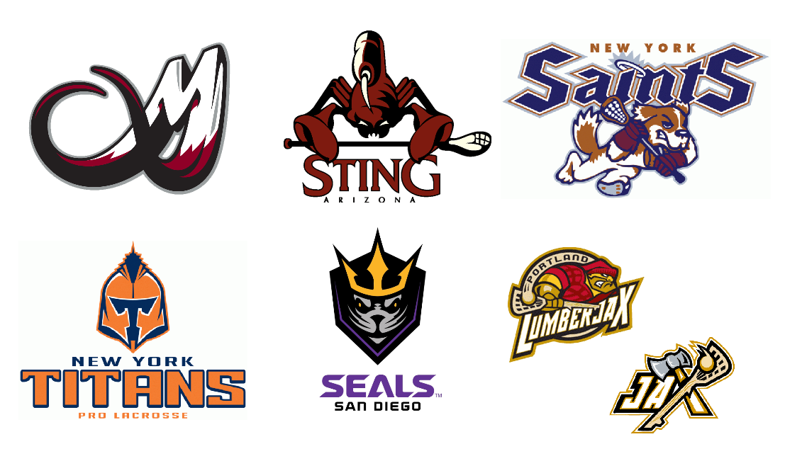
Written by Zeke Perez Jr. The National Lacrosse League just kicked off its 2018-19 season last weekend, so I thought I would commemorate the new campaign with another edition of For the Love of Logos. I wrote about how I came to be infatuated with sports logos and team identities in my first For the Love of Logos. As in past iterations of the column, I’ll identify some logos from the league’s history that are my personal favorites and some that I’m not as crazy about. The NLL provides an interesting case study for team names and logos. It started out as the Eagle Pro Box Lacrosse League in 1987, before becoming the Major Indoor Lacrosse League in 1988, and then the NLL in 1997. The league’s formative years were in the 90’s when sports logos in general were a little goofy and cartoonish, and the history of its teams reflects that. The NLL has typically featured team identities that are sillier and different from those typically found in the Big Four. Unfortunately, the league has lacked serious stability throughout its history, save for a few cornerstone franchises. It has housed teams in 36 different locations, despite only ever having between four and thirteen teams playing at one time. Even heading into this season, two teams have been added (San Diego Seals, Philadelphia Wings), one has rebranded (Vancouver Stealth became the Warriors), and two more have been announced to begin play next year (Halifax, New York). But that’s all a story for another time. What all of that change does mean, on a positive note, is that there have been plenty of unique lacrosse team names and logos over the last 30 years. For this piece, I looked at teams that played in the NLL, not back at teams that played only in the EPBLL or the MILL. A big shout out, as always, to sportslogos.net for the images! So, without further ado, let’s look at six of my favorites and six of my not-so-favorites. Favorites Colorado Mammoth Yep. I will 100 percent own up to being biased here. The Mammoth are my home team, the first box lacrosse team I ever watched, and my favorite team. With all that out there, though, I would still think the Mammoth have hands-down the best logo in the league right now even if I weren’t a fan. The logo is clean, strong, and evocative. So much is shown in one image. Simplicity wins. Arizona Sting I, for one, think scorpions are wholly underutilized in the sports world. The team name is a little different, but the logo itself is absolutely a winner. An extremely large scorpion (or a regular sized scorpion holding an extremely tiny lacrosse stick) is in an aggressive stance and ready to defend the desert. I’m a sucker for animals, fish, insects, or arachnids playing sports. Plus, I think it’s a great regional mascot for an Arizona team, just like the Diamondbacks or the Coyotes. New York Saints More animals holding lacrosse sticks, please! While it’s a little cartoony, this logo has a few great features. The ‘Saints’ name is played on by both the Saint Bernard and by the halo that dots the ‘i’ in the wordmark. The fact that the dog is wearing lacrosse gloves is a great touch too, reminding me of the glove-clad Pittsburgh penguin. With the NLL announcing a New York team as its 13th franchise, plenty of fans have called for the return of the New York Saints (although that is not one of the three options on the franchise website’s team name survey. Those would be the Force, Beacons, and Riptide). New York Titans Other fans are calling for the return of the New York Titans as the NLL’s new 13th franchise is named, and for good reason. The name is nostalgic in the city, harkening back to the old NFL New York Titans moniker. It also came with a cool logo. The Titan’s logo is almost the grandfather to the Vegas Golden Knights logo, with a ‘T’ inside the helmet (to Vegas’ ‘V’ helmet). The best touch is the skyscraper spire as the spike on top of the helmet (while the logo essentially stayed the same when the Titans moved from New York to Orlando, the skyscraper portion was obviously left behind). San Diego Seals The new kids on the block in 2018 roared in with a logo to win me over. San Diego took a purple color scheme that was currently untapped in the league, paired it with gold, silver, black, and a cool sea critter. While Seals is a fun and light-hearted name, the trident crown-sporting seal in the logo looks kind of tough. San Diego took an uncommon mascot name and infrequently used colors and made them work. Portland Lumberjax The Lumberjax logo feels very modern. It looks like one of the logos that Brandiose might create for a Minor League Baseball team today. In the primary logo, I like the added detail of the ‘Portland’ wordmark within the swoosh behind the lacrosse ball landing in the stick. The team also had a cool secondary logo - ‘Jax’, with the ‘x’ spelled out by an axe and a lacrosse stick finely crafted from wood. If it weren’t for that secondary logo, I could probably do without the team name ending in ‘x’ though. Apparently the Shamrox and Lumberjax had something against spelling at the time, both avoiding ‘-cks’. Flops Vancouver Warriors
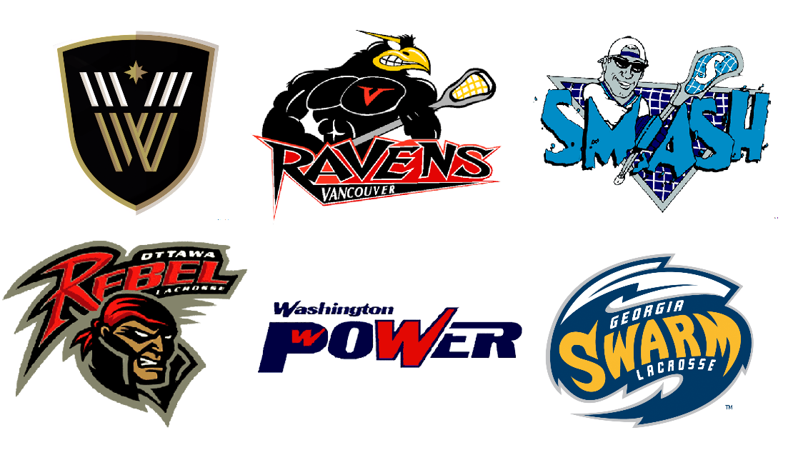
I’m talking about this one first to get it out of the way. It feels a little unfair listing it as an all-time flop. I don’t necessarily think that’s true and I don’t necessarily think it’s a bad logo. It’s just a little plain, and plain is something I think the franchise has suffered from. The team got the new Warriors name in 2018, but they had pretty boring logos when they were the Stealth, no matter if they were in Vancouver or Washington or San Jose. The black and gold color scheme is cool, but the crest feels like it would belong to a soccer club. That does fit in with the new, refined look the league itself is going for. So, since I’m saying more good things than bad things, let’s move on to a truly bad logo from an NLL team in Vancouver… Vancouver Ravens Was today the day you thought you’d see a bird with six-pack abs? I bet it wasn’t. While I’m usually a fan of animal mascots, especially those doing people things, I can’t get behind this one. He’s a weird mix of being cartoony and being shirtless and ripped in detail. He has human teeth and no pupils, both of which are creepy. He’s also apparently tatted up, displaying a big red V on left pec (at least he reps his city?). This is a lot going on for a raven. Syracuse Smash Maybe it was cool at the time (it probably wasn’t), but it’s way too 90’s now, and not in a good way. The backwards hat/sunglasses guy looks like a 90’s juice mascot. Definitely not Capri Sun or Sunny D, but the bootleg, dollar store versions of those drinks. Or maybe like the main character in an after school special cartoon where you learn that spending your time playing lacrosse is better than trying cigarettes with the bad kids. Ottawa Rebel Just like the Syracuse Smash mascot, the Ottawa Rebel is a shady character. First, the team name. Singular names have been popular throughout the NLL’s history (Wave, Rock, Rush, Attack, Storm). Rebel doesn’t work quite as well as the others. As for the logo, when your team’s mascot is just a menacing redhead with a ponytail and a very popped collar, there is a lot of room for improvement. Washington Power The D.C. team featured a nice red, white, and blue color scheme, so it had that going for it. But I’m not sure what’s going on with the ‘w’ that’s ‘hidden’ in the ‘p’. Is it supposed to be a ‘W’ for Washington D.C.? The city name is spelled out right above it, so that seems redundant. Were they trying to sneak the word ‘wow’ in the logo? Because that’s silly. Either way, it looks like the logo was typed up five minutes before the board meeting where it was pitched. It’s pretty dull. Georgia Swarm The Swarm logo is an ‘S’ that is supposed to be a swarm of insects or maybe an insect itself, but mostly looks like a wave or just a jagged ‘S’. I mostly dragged them into this so I could have the chance to talk about their terrible uniforms. The jerseys feature both bee striping down the sides and a honeycomb pattern on the shoulders with a winged lacrosse stick secondary logo on the front. And they come in yellow. So bad.
1 Comment
ChristopherRobin
12/30/2019 11:09:04 am
C'mon dude! The bandits logo isn't ONLY an instant classic but the Bandits are the longest tenured team in is original city... Making them like... The Chicago Blackhawks of lacrosse... Plus logos got a big orange hat that looks like the one Lloyd Christmas wore in dumb and dumber...
Reply
Leave a Reply. |
Archives
August 2024
Categories |
|
© 2012-2025, Nerds That Geek LLC.
All Rights Reserved. |
uWeb Hosting by FatCow


 RSS Feed