Written by Zeke Perez Jr. I’ve been a sports fan for as long as I can remember. Going to games, watching them on TV, and reading about them in the paper were all routine activities of my childhood. That’s the byproduct of being born into a die-hard sports family. Pair that with the fact that a couple of my teams won their first championships during my formative years and you’ve got the recipe for a fanatic. While those experiences pulled me in, something more caused me to obsess over the visual intricacies in the world of sports. During the summer and on weekends, I was a regular at the local library a few blocks down the street from my house. My visits were for numerous reasons: sometimes to do homework, other times to goof around on the computers, and more often than not to search for a new book – or rather, to search for an old familiar book. I habitually found myself in the sports section upstairs, nestled between the shelves, reading the same edition of John Fulgaro’s Sports Logo Guide. This was in the late 90’s, before anything like Chris Creamer’s SportsLogos.net, so it was my go-to source for logos at the time. The guide was a tome a few hundred pages in length and chock full of thousands of black-and-white prints of logos and wordmarks from contemporary and defunct teams. I studied the book nearly every time I walked through those library doors. I loved learning about the visual history of my favorite teams. I loved discovering new logos I had never seen before and then immediately deciding if I enjoyed or hated them. The love of logos, wordmarks, and uniforms has stuck with me to this day. I relish new information about the history of my favorite teams’ names and logos. I always enjoy the “what-could-have-been” stories and jersey prototype pictures for teams that were on the path to adopting a wildly different identity. I start every day by catching up on aesthetic news at the aforementioned SportsLogos.net and also at Paul Lukas’ Uni-Watch.com. Essentially, I love the look of sports. An interest in team identities really lends itself to a delight in minor league baseball. In the minors, teams are more free to be a little silly and creative with their names. Minor league teams also tend to draw much more from the cities and the regions that they play in, capturing the essence of the small towns that they call home. As a result, you get unique names you won’t see at the pro or even collegiate levels. These great names lead to awesome baseball caps, wacky uniforms, and creative promotions. So, in honor of spring training games starting in the minors today, here are a few minor league teams that I love the most based on their visual identities: AnimalsAnimals are common across the Big Four sports. Out of the 122 teams in the four pro leagues, 42 of those are named after some kind of creature or use an animal in their primary logo (or both). At the professional level, animal names tend to be limited to the powerful, menacing, and majestic, and the logos skew towards ferocious. This is not always the case at the minor league levels. There, unusual animals find their way into the figurative zoo. 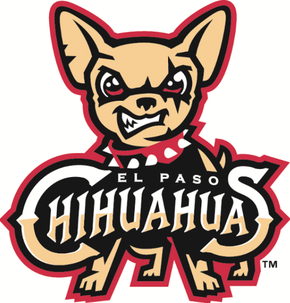 El Paso Chihuahuas (Triple-A, Pacific Coast League) Surprisingly, not a single team from the Big Four leagues has a dog breed nickname. Even if canines were better represented, it’s a safe bet that the tiny Chihuahua wouldn’t be the face of a franchise, despite how feisty and aggressive they are. But in the minors, the majestic Chihuahua gets the glory it deserves! The snarling Chihuahua in the primary logo and the pooch swinging a dog bone bat in the alternate logo make a great set. The baseball and dog bones arranged like a skull and crossbones makes a great accompanying alternate logo too. Hartford Yard Goats (Double-A, Eastern League) The G.O.A.T. can be a barnyard animal or the Greatest of All Time. In Hartford, both are one in the same. Technically, yard goat is railroad lingo for the switch engine that moves train cars between different locomotives, so this entry could’ve fallen into another category. But since the team’s primary logo is an actual goat chomping on a baseball bat, I put them here in the animal category. The Hartford Yard Goats easily have one of the best logos in minor league baseball. Other animal favorites: Not since Rocky and Bullwinkle has the flying squirrel been as heroic as that of the Richmond Flying Squirrels…mythical, adorable, and vicious all at the same time, the Portland Sea Dogs logo offers a lot, with the baseball bat toting sea creature leaping through a ‘P’…what better to follow up a sea dog than a mud cat! The Carolina Mudcats give you exactly what you’d expect out of a catfish logo, and it’s pretty wonderful, in its own endearing way… Region or City InfluencedOne of my favorite aspects of being a sports fan is the pride and sense of community that a team can help create. Minor league baseball teams often play in smaller cities and towns around the U.S. and they make quite the effort to anchor themselves into the roots of those communities. Their names often reflect the essence of life and culture in a region. 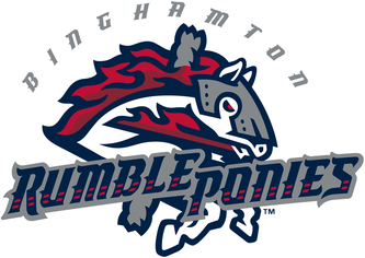 Binghamton Rumble Ponies (Double-A, Eastern League) Binghamton, NY is known as the “Carousel Capital of the World”, a nod to its collection of six of the remaining antique carousels. So when the Binghamton Mets decided to rebrand in late 2016 with a “name the team” contest, it was no surprise when four of the six finalists chosen by the serious merry-go-round city were carousel related. Rumble Ponies beat out Rocking Horses, Stud Muffins, and Timber Jockeys. A rumble pony is a carousel horse, and the majestic steed is captured perfectly in the team’s logo. In the team’s secondary logo, the horse has broken free and uses its carousel pole as a baseball bat. San Antonio Missions (Double-A, Texas League) From the Alamo to the four structures in San Antonio Missions National Park, missions are symbol of Texas’ culture and history. While it seems like it would be difficult to turn a historic building into a sports logo, the San Antonio Missions have succeeded in doing just that. The letters in the team’s wordmark and primary logo evoke Southwestern architecture, especially the ‘M’ which comes complete with a mission bell. Other regional favorites: The Biloxi Shuckers name pays homage to the city’s role as a seafood capital with an awesome angry oyster logo to boot. Not necessarily one of my favorites, but definitely worth mentioning, as the talk of the MiLB this offseason was the name change in New Orleans. Runners-up from the “name the team” contest were Night Owls, Crawfish, Po’boys, Tailgators, Red Eyes, and King Cakes, with New Orleans Baby Cakes ultimately winning. The new name – a reference to the baby figurine baked into a king cake during Mardi Gras – has drawn mixed reviews among fans and has yielded a nightmare-fueling mascot… Inanimate Objects/Other The inanimate object category is where the minors get really fun. While major league teams tend to stick with intimidating or traditional names, minor league teams push the boundaries and introduce some pretty wild mascots. 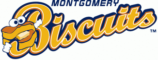 Montgomery Biscuits (Double-A, Southern League) Nothing says “the South” like good, down-home cooking, and biscuits are a Southern food staple. The Montgomery Biscuits bring food to life with their anthropomorphic buttermilk biscuit. Monty, a fluffy biscuit with eyes, gloved hands, and a butter tongue, appears in the team’s logo and on its cap. Now that’s a fun – and delicious – logo. Albuquerque Isotopes (Triple-A, Pacific Coast League) Fans of The Simpsons are surely fond of Springfield’s home team, the Isotopes. Homer Simpson definitely was, which is why he went on a hunger strike to prevent the team from relocating to Albuquerque. Nevertheless, ABQ found a way to make the team their own. When choosing a new team name for the Albuquerque Cannons just two years after The Simpsons episode aired, 67% of voters selected Isotopes. The ‘Topes name fits right in with the many national science labs headquartered in New Mexico, too. The Isotope ‘A’ primary logo has not only become somewhat iconic in pop culture – both being a clever play on Springfield’s logo, going on to appear in Breaking Bad, and appearing on promotional jerseys for Better Call Saul night – but it also makes for an excellent baseball cap insignia. Fresno Tacos/Grizzlies (Triple-A, Pacific Coast League) The Fresno Grizzlies have the best alter ego since Bruce Wayne first donned the Batman mask. Spurred by Fresno’s love of tacos, the Grizzlies trade in their usual identity every year and become the Fresno Tacos to help commemorate the city’s Taco Truck Throwdown. Fresno brings tacos and baseball together with new caps and jerseys each year. All of the on-field designs so far have been amazing, featuring both taco trucks and tacos themselves – I’m a proud owner of this Tacos cap. The Tacos bring sabor to the baseball diamond with the best promotion in the minors. Other inanimate favorites: Beer enthusiasts might find a new favorite team in the Hillsboro Hops – or at least a cool cap to rock when hanging out at their favorite brewery… The Akron RubberDucks pay tribute to the city’s history as the birthplace of a few big tire and rubber companies; thus, the mallard in their logo is not a typical bath time rubber duck but instead resembles a tire… Conclusion A number of the logos featured in this article were created by the graphic design company Brandiose. While some sports logo reviewers don’t like their work, critiquing the style and similarity of their designs as a whole, I am a fan. Their impact on the minors is undeniable and I feel like they do a great job of pulling out what it means to be from a city and incorporating that into their designs. Their designs are always fun and fit minor league baseball perfectly.
I mentioned earlier that teams in the minors experiment much more freely with silly names. While that’s true now, it hasn’t always been the case. Many of the teams in this list are the result of name changes that occurred in just the last few years and most of those came as a result of voting contests that allowed communities to choose a name that is close to them. I think this evolution of sports team names is great. It’s amazing to see imaginative and fun names and logos become the norm.
0 Comments
Leave a Reply. |
Archives
August 2024
Categories |
|
© 2012-2025, Nerds That Geek LLC.
All Rights Reserved. |
uWeb Hosting by FatCow

 RSS Feed