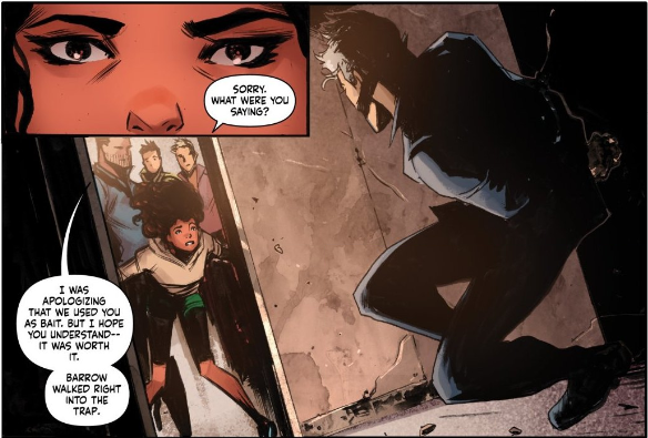
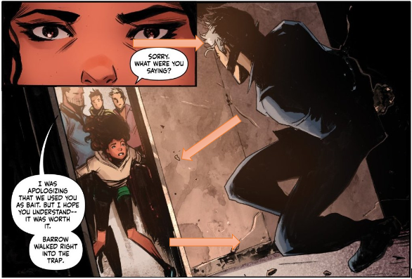
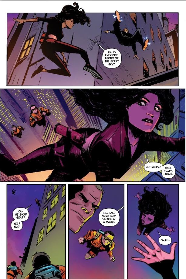
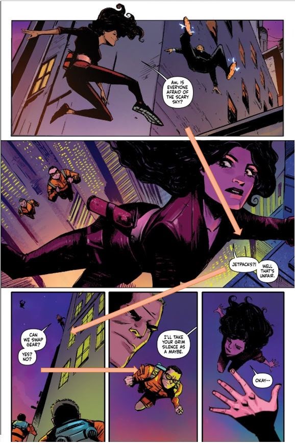
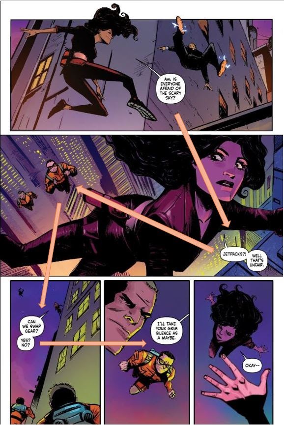
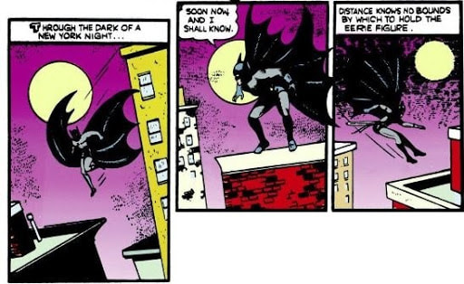
Written by Joel T. Lewis An Introduction Comics are not central to the discussion of literary criticism and perhaps that makes sense. Comics seem to actively resist scholarship, even from the elementary stages of annotation and bookmarking the quality of the individual issues’ paper is often too fragile, or too cheap to support a good highlighting and tab session. Even quoting a comic book becomes difficult as pulling dialogue and describing the artwork is ineffective and even disingenuous as the visual context is necessary, essential to understanding the effect of the dialogue. But comics resist scholarly investigation because of their content as well and it’s not in the ways you might think. The comic book is still considered by many to be a children’s medium but the storytelling is by no means juvenile. If anything, Comics resist scholarship because of their complexity as a medium, their nature as individual components in a massive shared narrative, and their necessary combination of two very different storytelling methods: graphic and written narratives. Effective lettering and panel layouts, at least to Romance and Germanic language readers, understand the reader’s desire to read right to left across a comic books’ panels, strategically placing speech bubbles and panel borders to accentuate the art in subtle and effective ways. Take this two panel section from issue 9 of Joe Henderson and Lee Garbett’s series from Image Comics Skyward (2018): As the reader moves from the first panel to the second across the page left to right revealing the bound and gagged Roger Barrow their eye is drawn back to the the left where that second panel’s dialogue begins. Then you pass over the bound figure once again as your eye finishes reading the panel, art work included on the right side. This diagonal trajectory of the the eye is the quickest and most subtle device used here but it is also the most important. By the time you have finished reading these two panels for the first time, you have effectively “read the art” 3 different times. Understanding the logistics of drawing the eye to a specific point is a necessary skill in the artist’s tool belt but in comics the script writer and the letterer must be aware of and able to manipulate these focal points in order to effectively incorporate dialogue and exposition to lead the eye of the reader where it needs to go. Now if we look at a full page of the same issue of Skyward where the same creative team seems to contradict the trajectory of the eye in the first two panels I showed you we can discuss how we read that page differently: Now on this page the dialogue bubbles seem to divert you around the bulk of the second panel’s art and down to the final three. But if we pay particular attention to what the dialogue in that second panel reveals to us, that Willa Fowler’s pursuers are wearing jetpacks, our eyes are drawn to the left side of that panel to investigate that revelation before returning to the next bit of dialogue. 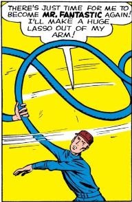 In this way every component of the comic, all of the creative team, contributes to how your eye passes over and processes the images in front of it. And take note that Willa’s line, “Jetpacks?! Well that’s unfair.” would seem to be more expositional than might be necessary until we look at that panel again to discover that Garbett’s thugs are wearing backpacks of some sort, but Willa’s line tells us that they are in fact jetpacks. Without this line, we can’t be sure that they are wearing on their backs because of the perspective from which Garbett chose to draw them. Skyward is an example of a comic whose core concept, a world without gravity, lends itself to visual exposition perhaps better than most comics but it also serves as a model for the shared universe shorthand that has developed in Marvel and DC comics throughout their publication history. In Skyward you don’t have to be reminded panel to panel that the effect of gravity has been reduced because you know the context of the world from the beginning. Gold and Silver Age comics had a knack of over-narrating from panel to panel, seeming to constantly remind the reader of the context, or the world in which the comic was taking place. Take this panel (right) from page 18 of Fantastic Four (1961) no. 1 in which Reed Richards (Mr. Fantastic) spells out exactly what he is doing to combat the three-headed monster the Fantastic Four have found guarding Monster Isle. Not only does Reed describe the actions artist Jack Kirby has brought to life, but he also tells the audience his name, reminding them of the moniker “Mr. Fantastic.” This repetition and over-narration throughout the Gold and Silver Ages of Comics served to firmly establish a character’s identity and power set so that anyone picking up the odd issue for the first time was quickly brought up to speed. But even at this early stage there was something to be said for the showing vs telling method of comic book scripting. 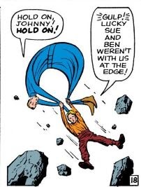 In this panel (left) from the very same page of Fantastic Four no.1 Kirby’s depiction of Johnny Storm’s impromptu use of Reed as a parachute is allowed to speak for itself as Stan Lee’s narration in the previous panel firmly established that Mr. Fantastic is able to stretch his body like a rubber band. Even as early as Batman’s first appearances in Detective Comics circa 1961 this tendency to over-narrate even with as dynamic and captivating a figure as the Batman was in full effect. If we look at the third panel (below) from the first page of Detective Comics no. 31 we see that the narration of that panel, while atmospheric and foreboding, is ultimately superfluous as the the information we’re given by the artwork is exactly the same. Now in present day comics, we don’t see Silver Surfer’s internal monologue which tells us he must summon his power cosmic to match might with the thundering hills of Ego the Living Planet. But I believe this tradition of over-narrating and over-monologuing throughout the years has made it easier for our modern superhero comics to lean on the presumption that the audience knows a hero’s power set. Because of the nature of comics’ shared universe narrative structure and the self referential shorthand which is facilitated by that structure, comic readers have been trained to account for gaps in continuity and to side-step crossover exposition and character appearances as they move along the narrative within a single issue. The audience understands that the shared comic book universe has numerous storylines progressing through the lenses of it’s other characters while the events of their own book are unfolding before them. It is this awareness and acknowledgement of the shared continuity of the comic book universe which has contributed to the move away from overly expositional narration and dialogue in today’s comics. We now understand the visual queues of Superman’s X-ray vision showing him dangers out of sight, we understand that the comic specific onomatopoeias “snikt” and “thwip” mean Logan’s popped his claws and Spidey’s about to swing into action, and we know the shimmering energy coming from Norrin Radd’s hands is his Power Cosmic with no added context. I believe we know these things so intimately because of their repetition, because of how comics have trained us to bridge issue and fictional world continuities as we read, and because the visual elements of comic books are so rich in content that they are the most efficient tools for filling in narrative gaps. 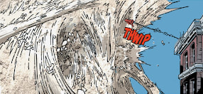 To illustrate how effective the combination of art, text, and shared narrative shorthand can be take this panel (left) from Peter Parker: The Spectacular Spider-Man (2017) no. 309. This panel’s entire context can be drawn without any outside clues because of the strength of the shared universe narrative and the combination of its text and art. Every element in this panel is necessary, the tiny red hand, the squiggly grey rope connecting the hand and the building, the building itself, the swirling tornado of sand, and finally the onomatopoeic clincher, “Thwip.” The “Thwip” is so important in this panel because of its function as Marvel Universe shorthand, identifying the tiny red-gloved hand as Spider-Man’s, the grey rope as webbing, and simultaneously informing us that the sand tornado is the work of William “Flint” Marko aka Sandman, a known foe of Spidey. But this single piece of text doesn’t just tell us who we’re dealing with, it tells us where we are, or where we could be. Without knowing that red-glove belongs to Spider-Man and that the swirling vortex that’s swallowed him up is Sandman, for all we know that could be a red-gloved cowboy caught up in a sinister dust storm in the middle of a frontier town in the wild west who’s managed to lasso a nearby building and is holding on for dear life. But because we know “Thwip” means Spider-Man, and Spider-Man lives in New York we know where we are, and we reinforce who we’re dealing with, because Sandman is a New York City villain. This nonsense word despite being nonsense carries with it the weight of the comic book universe that created it, the universe without which, it would not exist and it’s inclusion in a panel as rich and dynamic as the one we’ve been discussing radically effects how that panel is interpreted and I would argue that it is able to do so because of the Gold and Silver Age tendency to over-narrate the actions of its characters. In this series I aim to examine individual issues and specific runs from several comic publishers to analyze how the interaction of visual art, text narration and dialogue, and shared universe shorthand produces effective and entertaining comics, challenging but rewarding comics, but also how unbalancing those 3 elements can produce comics that miss their mark.
0 Comments
Leave a Reply. |
Archives
May 2024
|
|
© 2012-2025, Nerds That Geek LLC.
All Rights Reserved. |
uWeb Hosting by FatCow
